Where legacy meets modern technological development

Problem

With the technological landscape expanding, there was a need for a new technical development company that combined experience with innovation. The task was to harness the legacy of the team behind the scaling of Just Eat and give it a fresh, modern twist in the form of "Build Circle." This required a clear understanding of the brand’s audience and positioning to define a suitable approach.

Solution

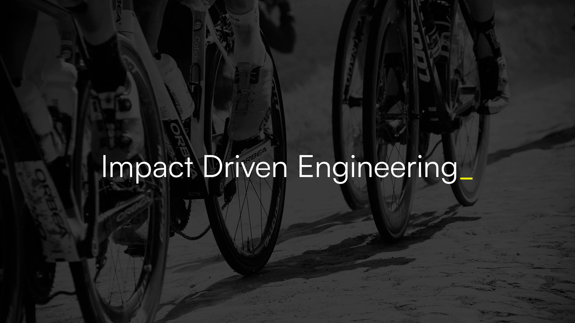
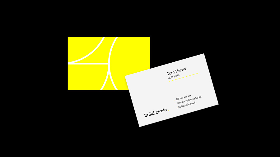
The name " Build Circle " evokes imagery of growth, completion, and unity, which became foundational in shaping the brand. Given the company’s heritage and ambition, a bold colour palette of deep black and vibrant neon was selected.

This combination conveys the brand's grounded expertise and electrifying innovation. The logo and visual identity harness circular motifs. Concentric neon circles, representing layers of development and growth, invite viewers into a dynamic spiral of progression. The circle also symbolises the holistic approach the company adopts - from ideation to full-scale technical deployment.

Let's talk!

People-first. Design-smart. Zero nonsense.
We’re not chasing awards or buzzwords — we’re here to solve your problems, elevate your brand, and make the process refreshingly straightforward. We listen. We think. We create. We deliver. And we make it fun (because why not?).

Let's work together!