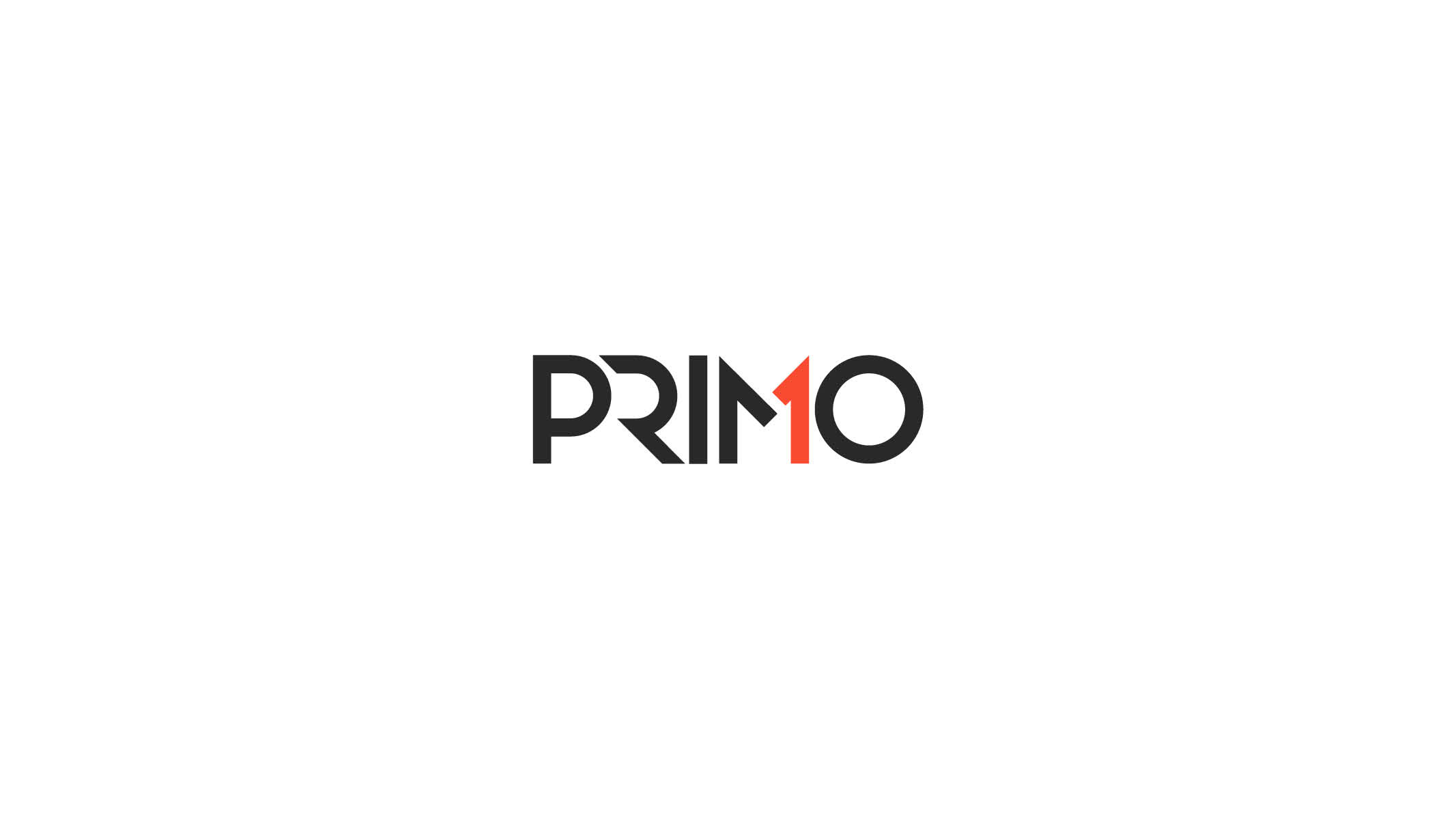
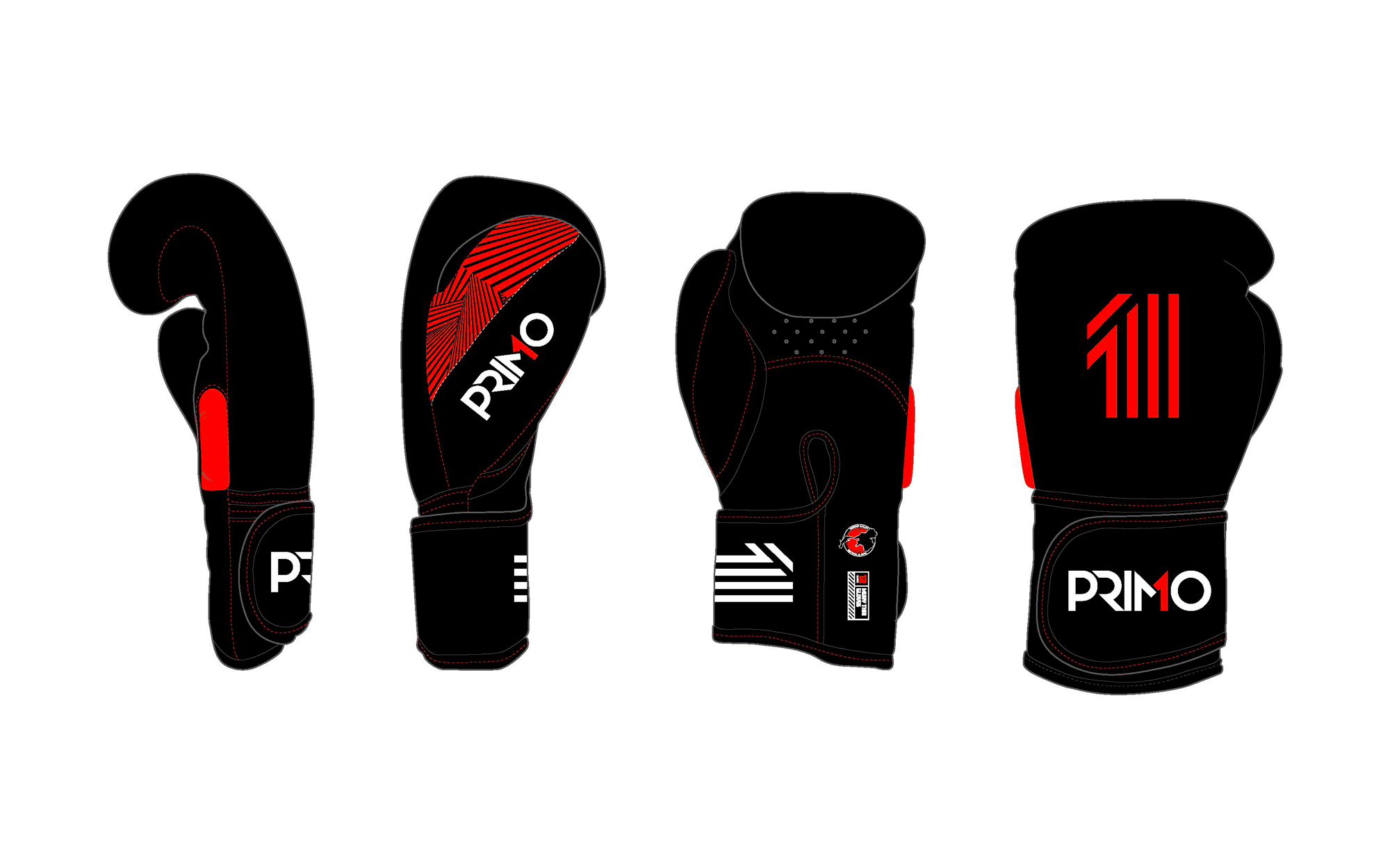
The brand identity of "Primo" needed to strike with the impact of a Muay Thai elbow, yet flow with the fluidity of its kicks. To capture this essence, a custom typeface was developed. Angled and sharply defined, the typography symbolised the precision and agility inherent in Muay Thai.
The colour palette was intentionally kept bold and straightforward. Black represented the grit and tenacity of fighters, red embodied the passion and energy of the sport, and white offered a clean contrast, suggesting the purity and discipline of the martial art.
With its distinct typography and powerful colours, "Primo" successfully positioned itself as the modern standard-bearer for Muay Thai fightwear, paying homage to tradition while capturing the spirit of the contemporary fighter.