Motion with dynamic design
We reimagined Fight Gravity’s brand identity with a bold, motion-inspired typographic design — transforming the letter ‘g’ into a dynamic symbol of energy, tension, and the art of defying gravity.

In the rapidly evolving CBD market, standing out requires more than just a quality product. Satipharm, already boasting Swiss-grade excellence, sought to reinvigorate its brand image to not only reflect its top-tier quality but to also differentiate itself amid a sea of competitors. This required a clear understanding of the brand’s audience and positioning to define a suitable approach.
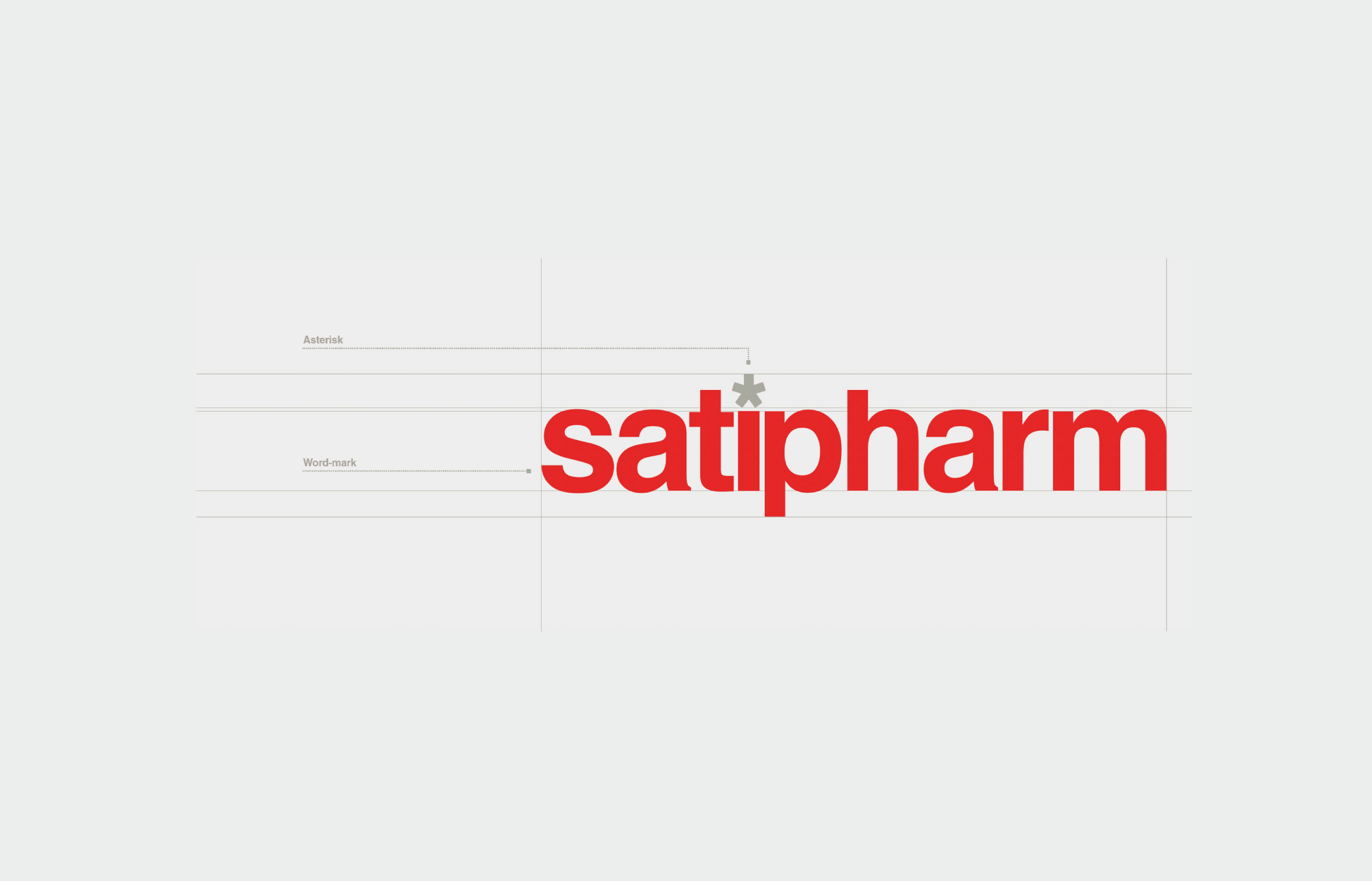
The essence of Satipharm's revitalization was the rich Swiss heritage - a globally recognised symbol of precision, quality, and innovation. We decided to bring to the fore the emblematic Swiss ethos that Satipharm embodies.
Switzerland's pristine alpine landscapes, its commitment to perfection, and a legacy of unparalleled craftsmanship served as the palette for Satipharm's rebranding. The visual identity was reshaped to intertwine sleek modern design with classic Swiss motifs.
A colour scheme reminiscent of the Swiss Alps - crisp whites, and serene blues, - was chosen, encapsulating the purity and potency of Satipharm’s CBD. The reinvigorated Satipharm now stands not just as a CBD brand, but as a beacon of excellence, promising users world-renowned Swiss quality with every drop.


People-first. Design-smart. Zero nonsense.
We’re not chasing awards or buzzwords — we’re here to solve your problems, elevate your brand, and make the process refreshingly straightforward. We listen. We think. We create. We deliver. And we make it fun (because why not?).
Let's work together!

