Branding
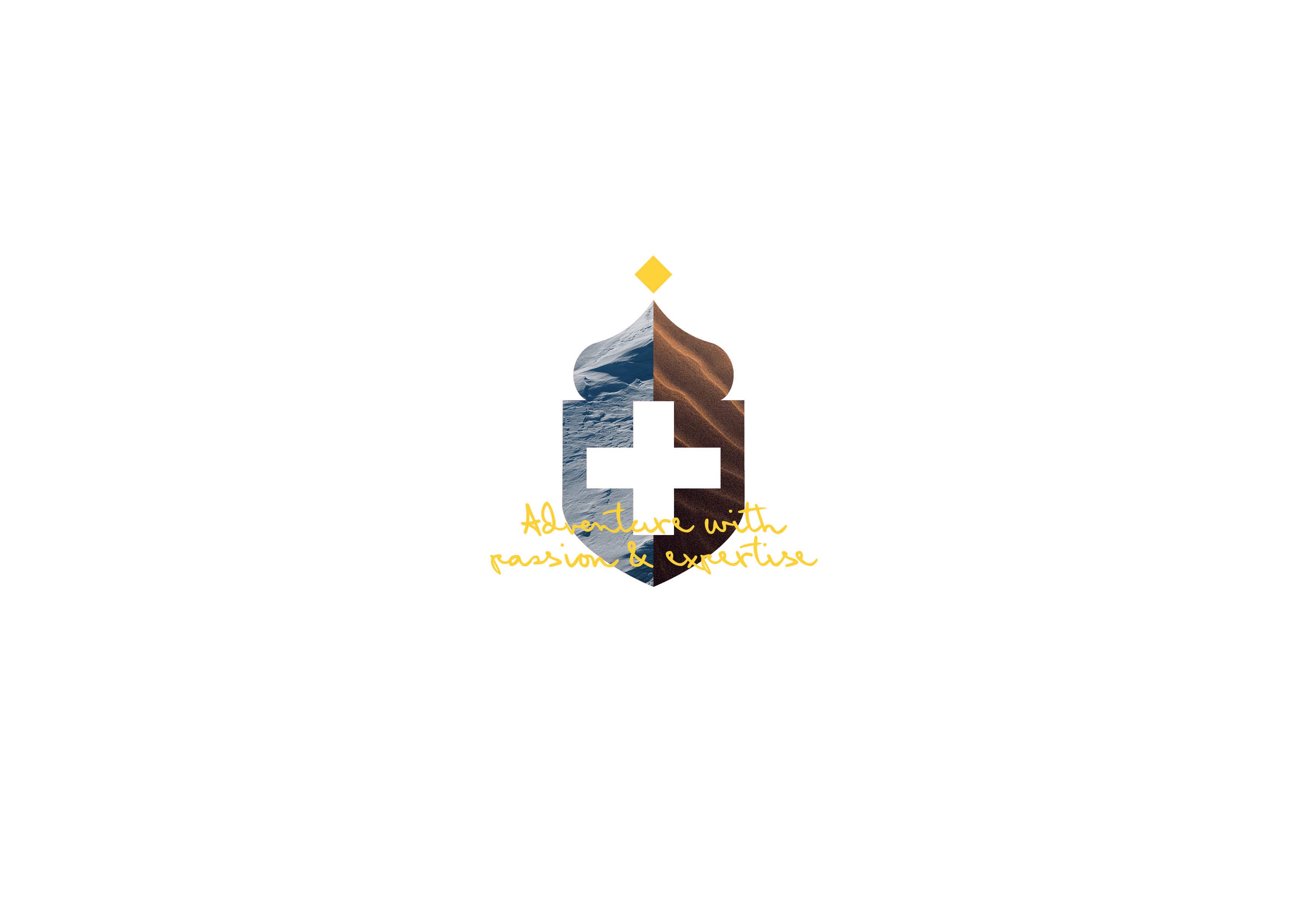
United Terra
A brand refresh for energy innovation
We revitalised United Terra’s brand with a refined identity system, clarifying sub-brands, amplifying recognition and aligning their visual presence with a bold renewable energy vision.
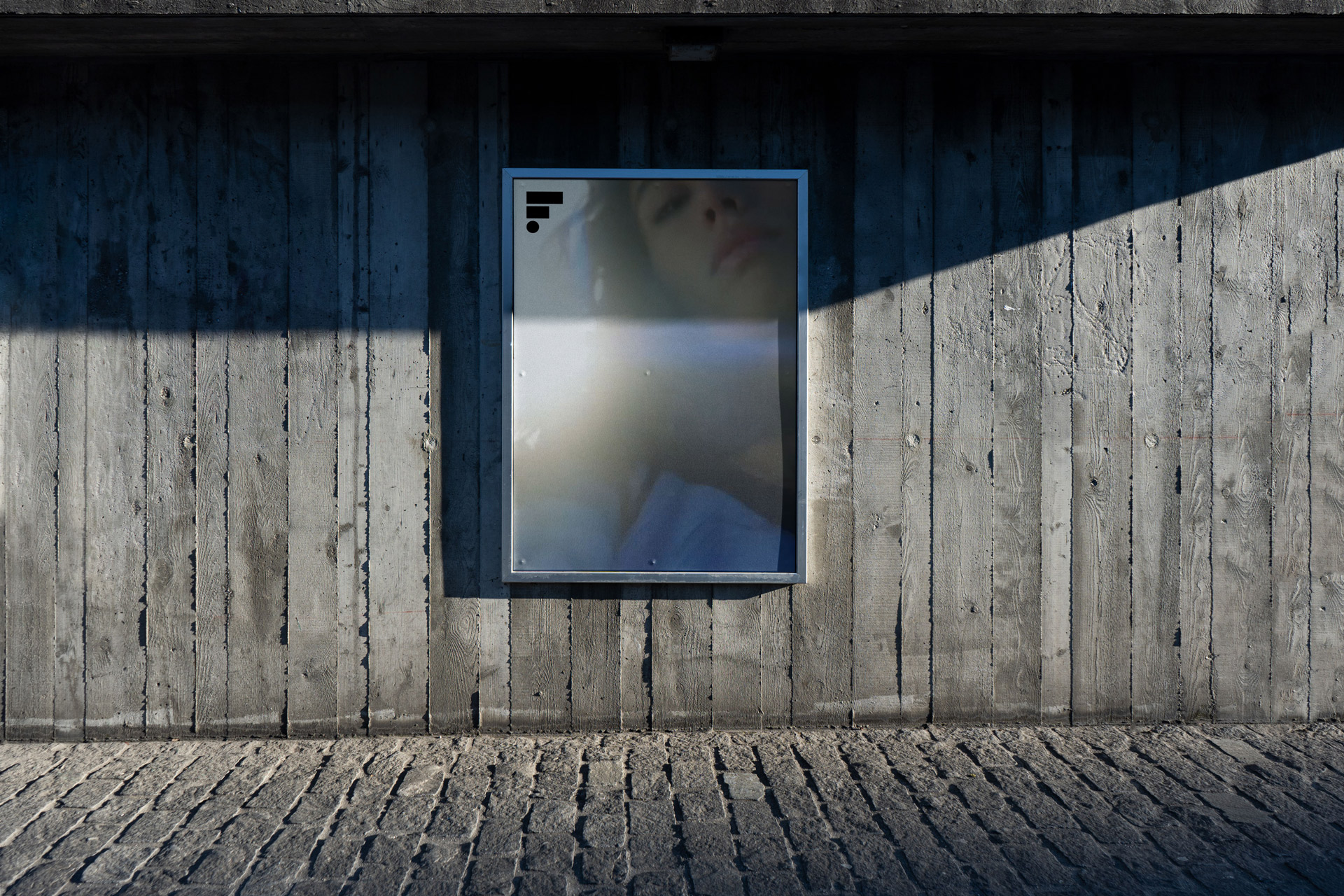
With the evolving landscape of film production, Fight Gravity Films required a brand refresh that would not only encapsulate their dynamic nature but also position them as a modern and innovative motion company. This required a clear understanding of the brand’s audience and positioning to define a suitable approach.
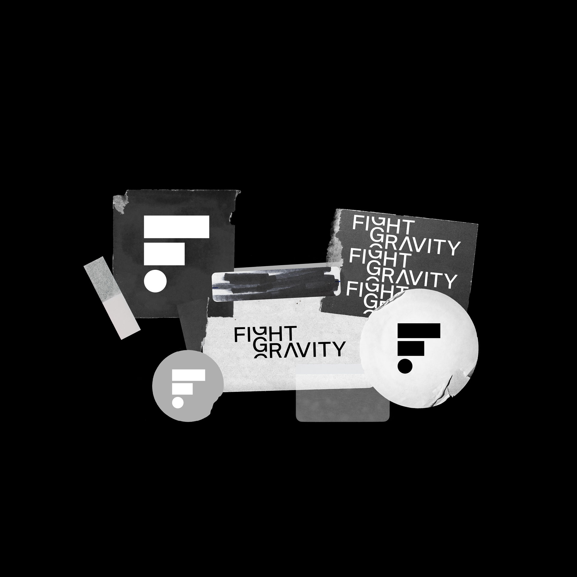
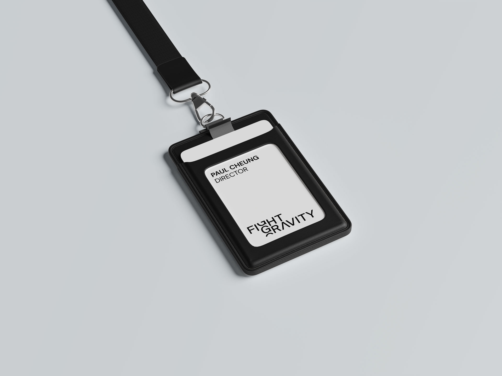
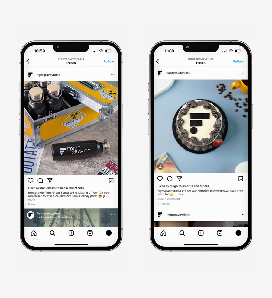
To revitalise "Fight Gravity," the essence of motion and contrast, inherent in the name itself, was harnessed. A slick and modern typographical approach was taken, ensuring the design stayed true to the brand's core values while rejuvenating its image. The letter 'g' in "Fight Gravity" became the centrepiece of the identity.
By introducing tension into its design, it subtly alludes to the force of gravity being pulled or 'fought' against, reflecting the brand's name. This typographical tweak not only offered a unique visual hook but also became the pivot for potential animations, enabling the letter 'g' to have fluid movement, showcasing the company's expertise in motion.
The letter 'g' in "Fight Gravity" became the centrepiece of the identity. By introducing tension into its design, it subtly alludes to the force of gravity being pulled or 'fought' against, reflecting the brand's name. This typographical tweak not only offered a unique visual hook but also became the pivot for potential animations, enabling the letter 'g' to have fluid movement, showcasing the company's expertise in motion.


People-first. Design-smart. Zero nonsense.
We’re not chasing awards or buzzwords — we’re here to solve your problems, elevate your brand, and make the process refreshingly straightforward. We listen. We think. We create. We deliver. And we make it fun (because why not?).
Let's work together!