Branding
Satipharm
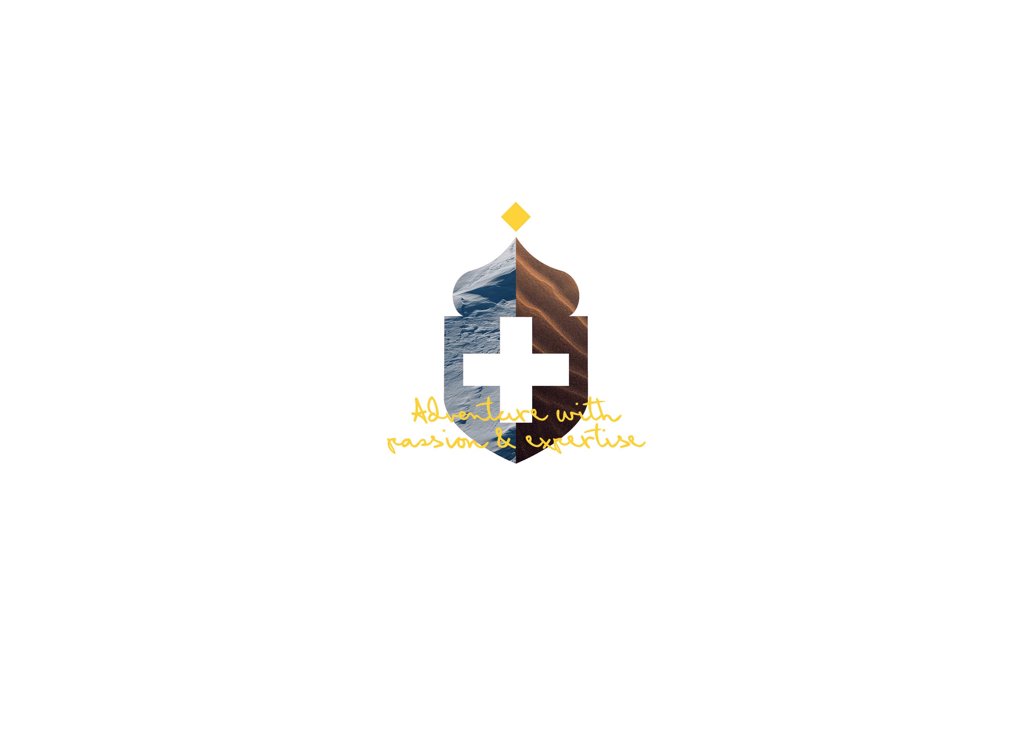
Swiss-grade excellence in the global CBD market
We elevated Satipharm’s identity by drawing on its Swiss roots, creating a refined visual brand that reflects purity, precision and standout quality in the global CBD market.
With the increasing need for immediate expert advice in various fields, Consultz aimed to launch an app that offers users direct access to professionals for swift consultations over calls. The task was to develop a brand identity that would resonate with the dynamic and instantaneous nature of the service. This required a clear understanding of the brand’s audience and positioning to define a suitable approach.
For "Consultz", the core of the service was clear communication between experts and users. This was visually captured with an icon of two interconnecting speech bubbles, representing the direct dialogue and exchange of expertise. The fluid connection between the bubbles signifies the seamless and dynamic nature of the app. To further enhance the brand's vibrancy and ensure it stands out in a saturated app market, a palette of magenta and purple was chosen.
These hues not only gave the brand a unique visual identity but also alluded to its energetic and fast-paced service. With its interconnected icon and lively colour palette, Consultz successfully positioned itself as the go-to platform for real-time expert advice, symbolising immediate connectivity and knowledge exchange.
People-first. Design-smart. Zero nonsense.
We’re not chasing awards or buzzwords — we’re here to solve your problems, elevate your brand, and make the process refreshingly straightforward. We listen. We think. We create. We deliver. And we make it fun (because why not?).
Let's work together!