The essence of the pharmaceutical industry – precision, trust, and clarity – became the pillars for the brand refresh. To evoke these sentiments, a clean, crisp, and clinical typographical approach was chosen.
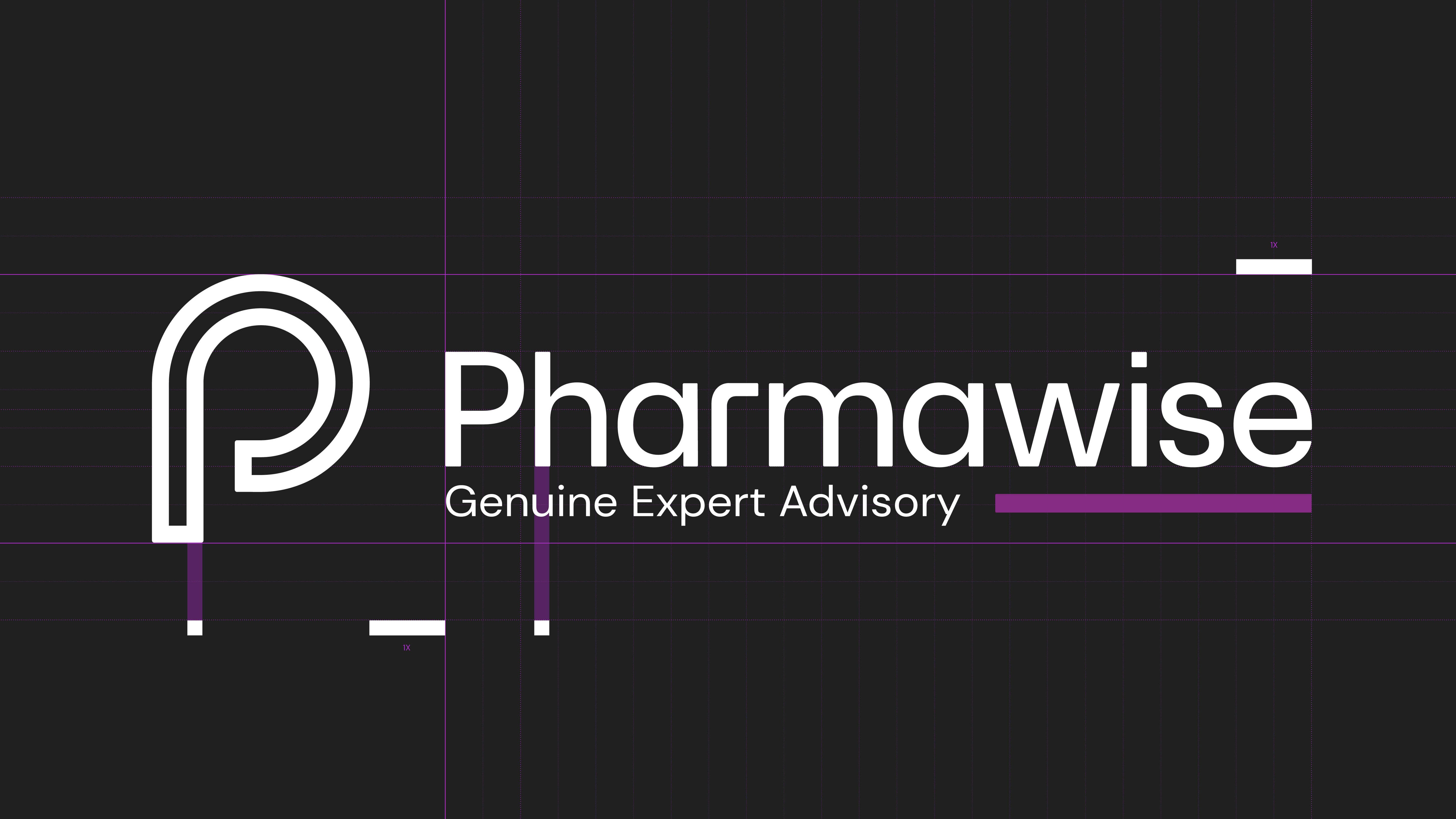
This ensured the brand retained its air of professionalism while also radiating modernity. Accompanying the refined typography, the brand's icon underwent a subtle yet significant transformation. An updated glyph, taking inspiration from both pharmaceutical symbology and consultative guidance, was introduced. This glyph, combined with the brand name, presented a cohesive and instantly recognisable identity.
A bold purple was incorporated, symbolising innovation and depth, while clean white echoed the clinical, trustworthy aspect of the pharmaceutical world. With its refreshed typography, updated icon, and vibrant colour palette, Pharmawise repositioned itself as a beacon of modern consultancy in the pharmaceutical landscape.